Vignette / Tutorial
This tutorial will show you the basic things that can be done with this Plotly repo with the current assortment of charts available.
Note
Before you begin, you need to have certain packages installed. Be sure to download the following via pip install:
numpy
pandas
plotly
plotly.express
plotly.graph_objects
plotly.offline
Then be sure to:
Download (or clone) the file from Bitbucket located here: https://bitbucket.spectrum-health.org:7991/stash/projects/QSE/repos/easyplotly/browse
Navigate to the root directory of the downloaded file
Run the following in your Anaconda terminal:
python setup.py develop
That will install the package onto your local machine. To use, simply import the following:
from easyplotly import Interactive_Visuals
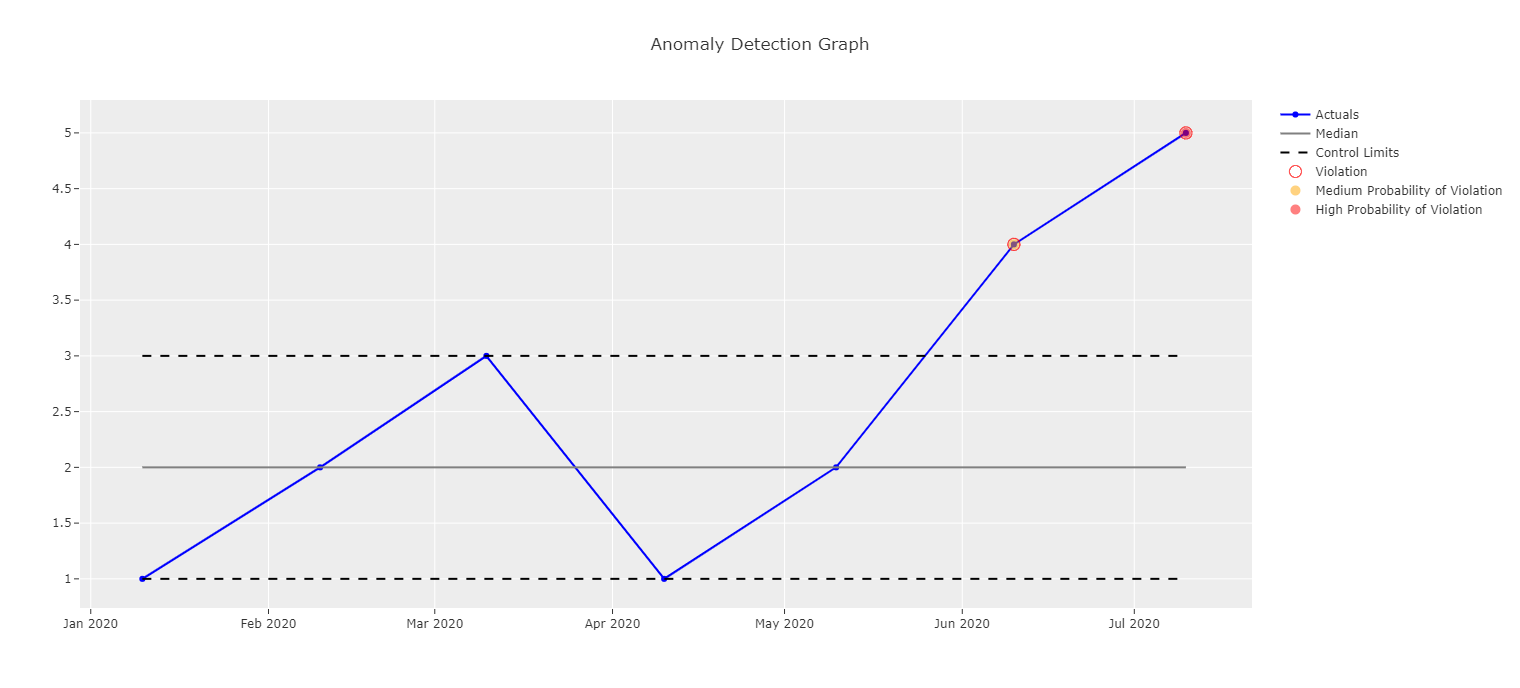
Control Chart
For creating control charts, the data frame must contain variables named the same as in the example below. Make sure the Date variable is set to the index if it isn’t already (ADTK will do this by default). Load in the Interactive_Visuals class and then call the plot function.
df = pd.DataFrame(dict(
        Date=["2020-01-10", "2020-02-10", "2020-03-10", "2020-04-10", "2020-05-10", "2020-06-10", "2020-07-10"],
        Values=[1,2,3,1,2,4, 5],
        Median = [2,2,2,2,2,2,2],
        UCL = [3,3,3,3,3,3,3],
        LCL = [1,1,1,1,1,1,1],
        Violation = [0,0,0,0,0,.5, .9]
    ))

#Pandas set date to index col (will be how ingested from ADTK)
df = df.set_index("Date")
iv = Interactive_Visuals(df)
plot(iv.control_chart_ADTK(title = "Anomaly Detection Graph"))
Scatterplot
There are a few variations on what can be done with a scatter plot. First you will want to load in a data frame (here, we’ll be using the infamous iris dataset).
df = px.data.iris()
iv = Interactive_Visuals(df)
To obtain a very basic scatterplot, run this:
plot(iv.scatterplot(x = "sepal_length", y = "sepal_width"))

Marginal Scatterplot
To create a scatterplot with a marginal box plot, run the following:
plot(iv.scatterplot(x = "sepal_length", y = "sepal_width", marg_x = "box", marg_y = "box"))
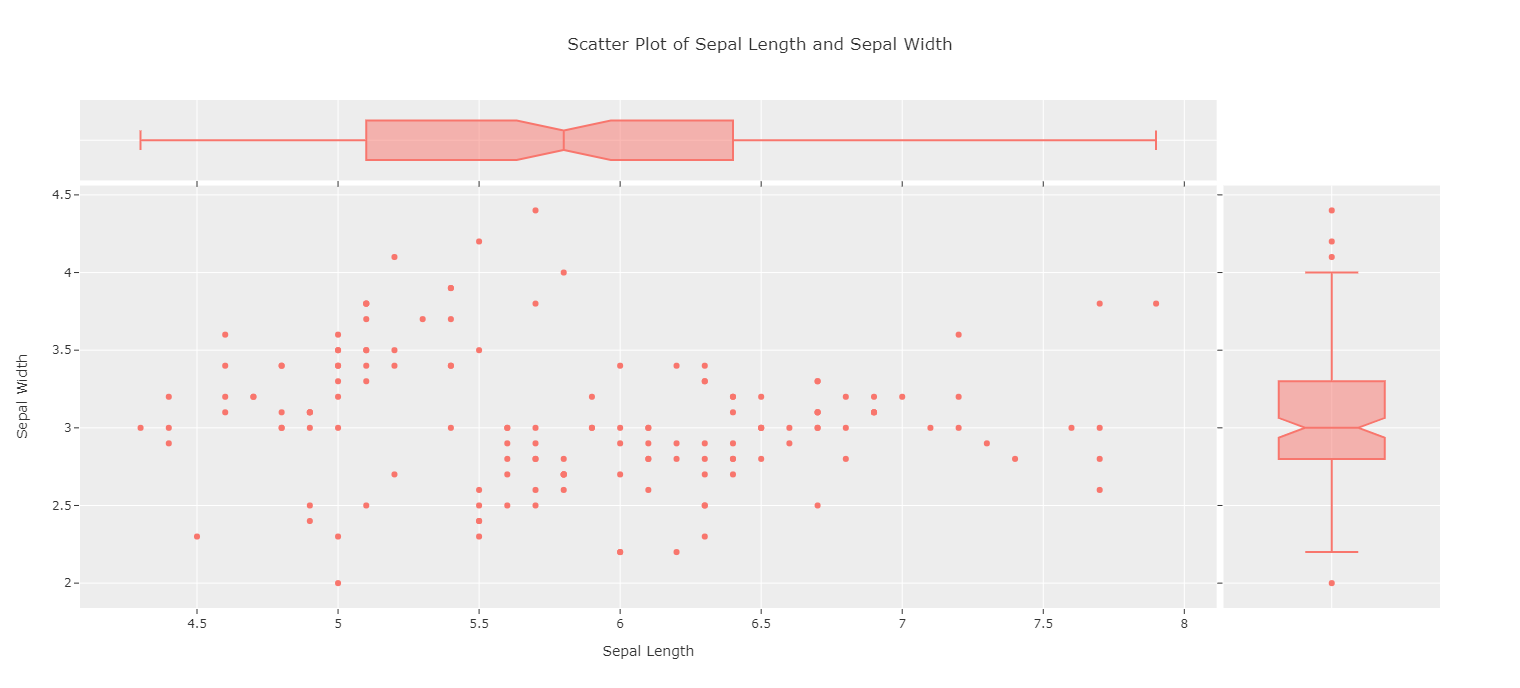
(Note that histograms or violin plots can also be plotted in the margins.)
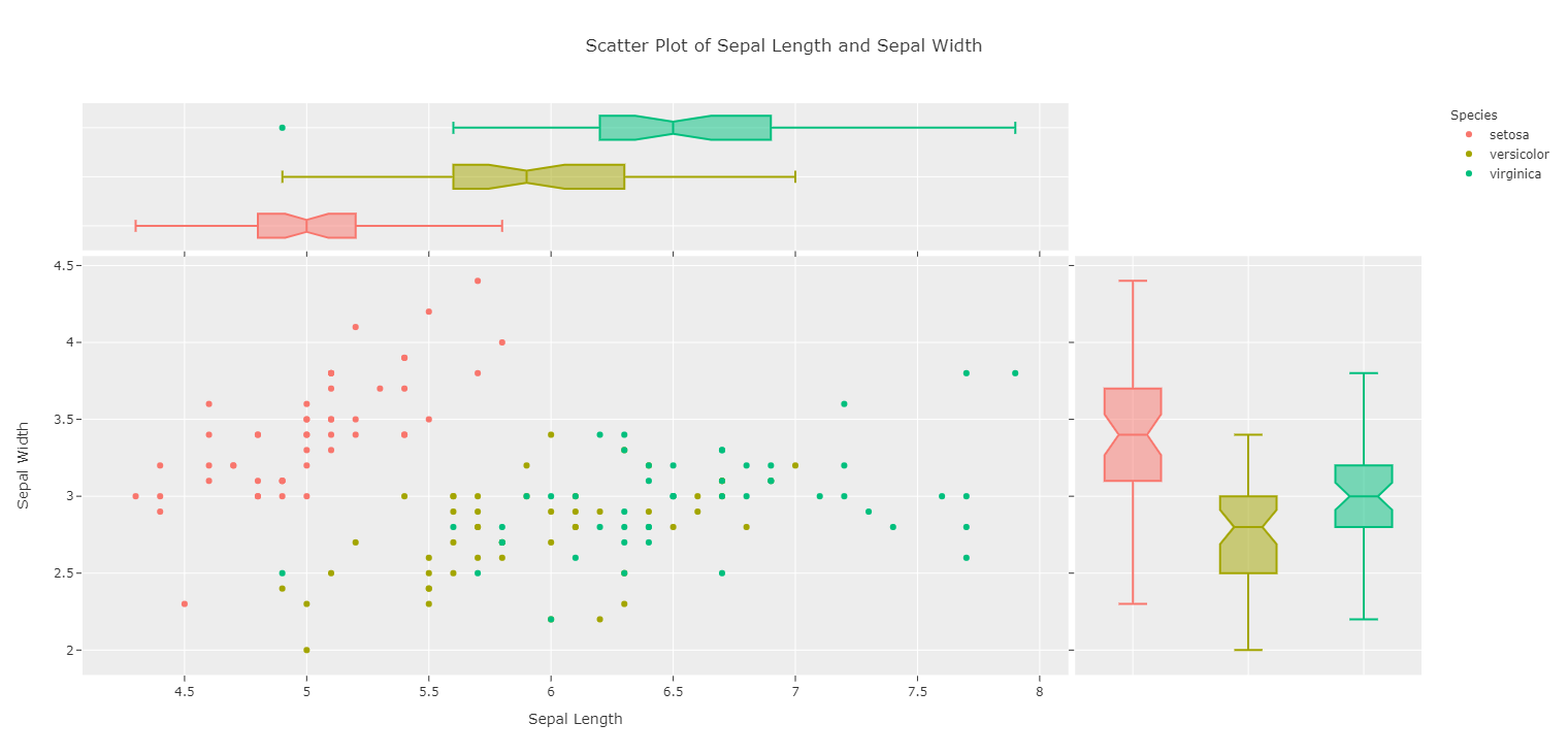
Change Colors Based on Another Variable
Scatterplots can be labeled based on a factor variable:
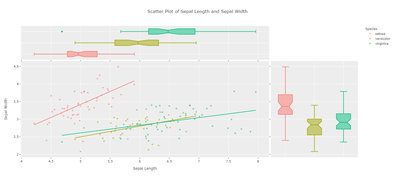
plot(iv.scatterplot(x = "sepal_length", y = "sepal_width",
marg_x = "box", marg_y = "box", color = "species"))
Or a numeric variable:
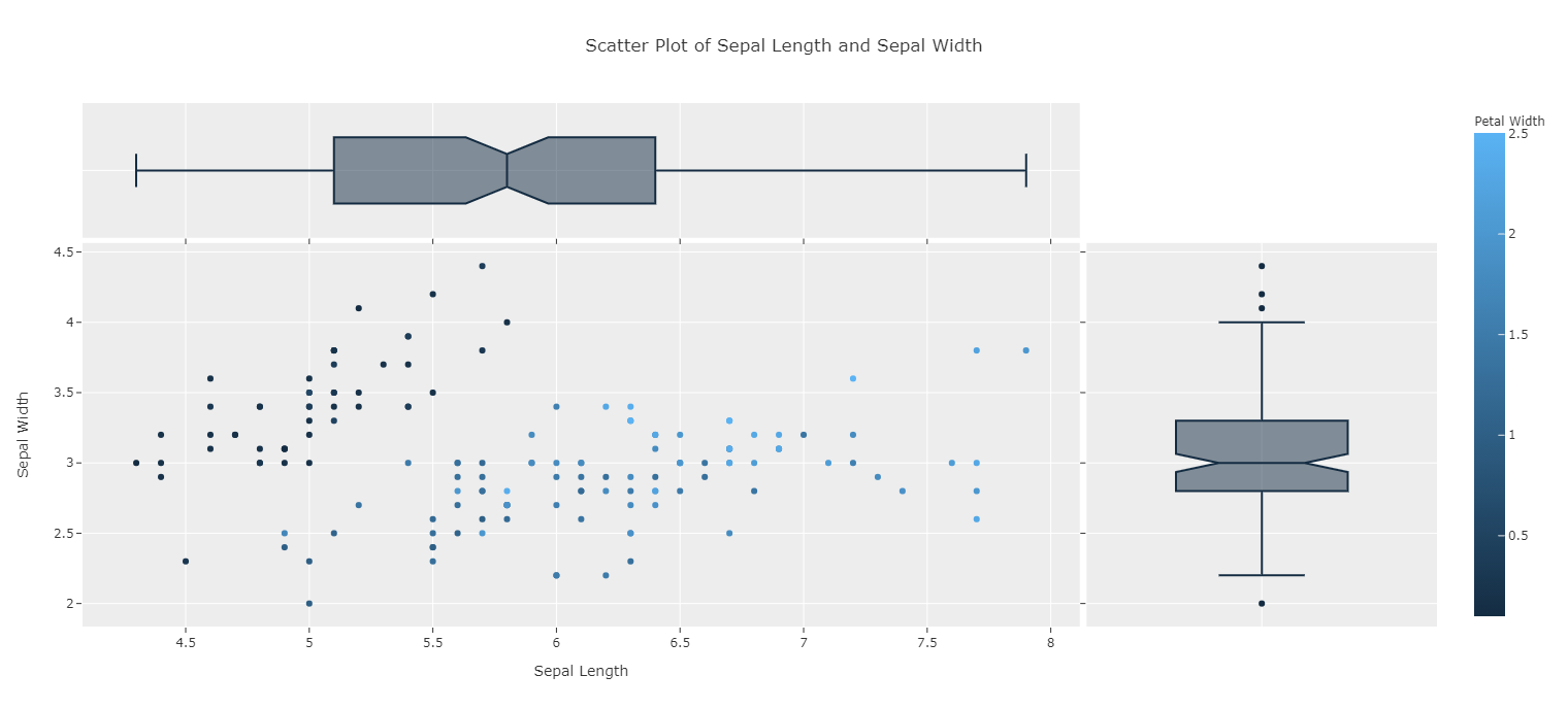
plot(iv.scatterplot(x = "sepal_length", y = "sepal_width",
marg_x = "box", marg_y = "box", color = "petal_width"))
Prettify with Jitter and Opacity
If points overlap, jitter can be applied. If the default jitter is unsatisfactory, the value can be changed with jitter_sd:
plot(iv.scatterplot(x = "sepal_length", y = "sepal_width",
marg_x = "box", marg_y = "box", color = "species", jitter = True))

Opacity can also be lowered for points closeby to be more easily seen:
plot(iv.scatterplot(x = "sepal_length", y = "sepal_width",
marg_x = "box", marg_y = "box", color = "species",
jitter = True, opacity = .5))

Add Trendlines
Trendlines can also be added via “ols”:
plot(iv.scatterplot(x = "sepal_length", y = "sepal_width",
marg_x = "box", marg_y = "box", color = "species", jitter = True,
opacity = .8, trendline = "ols"))
Histogram
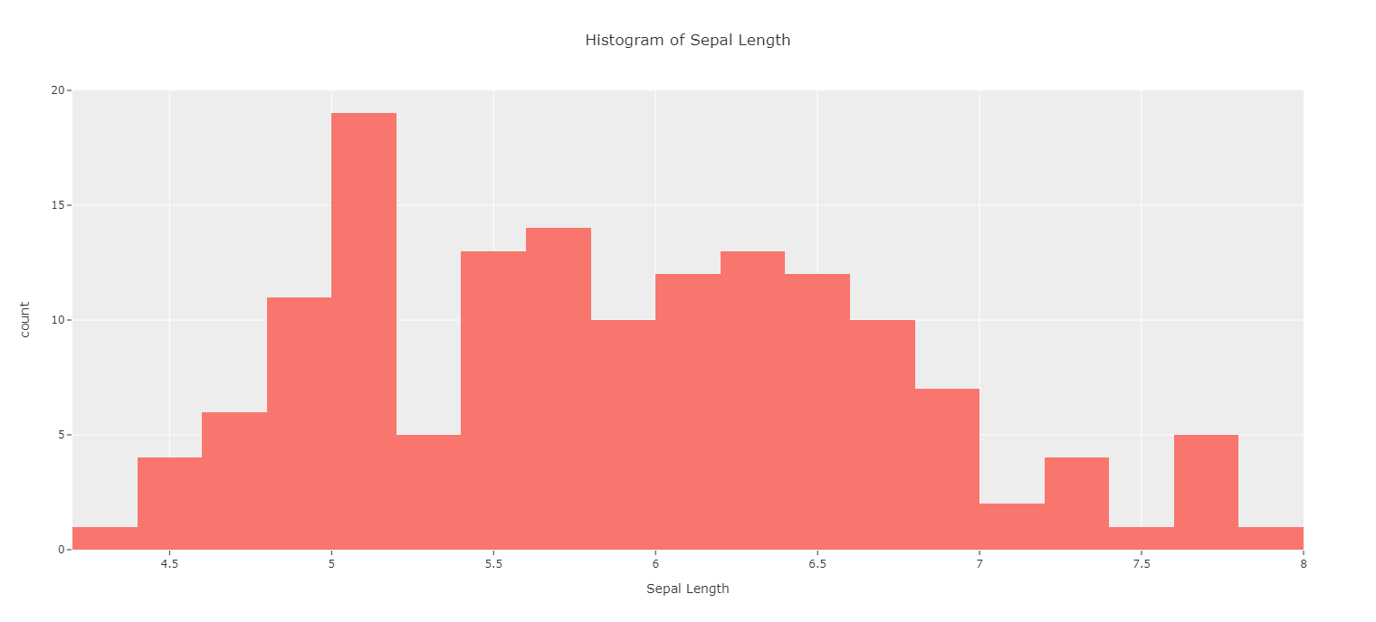
A basic histogram can be created by using a numeric variable:
plot(iv.histogram(x = "sepal_length"))
Facet on Categorical Variable
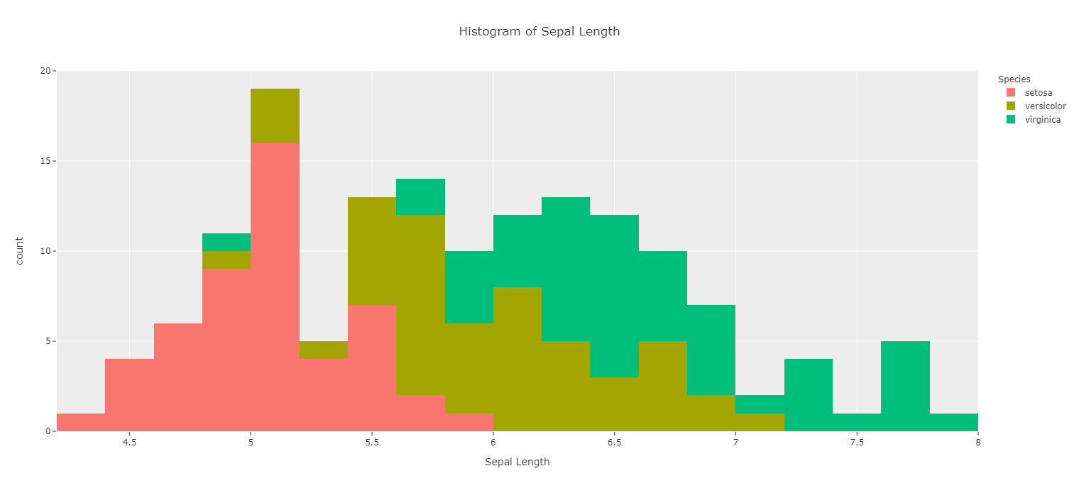
This histogram can be split based on a categorical variable:
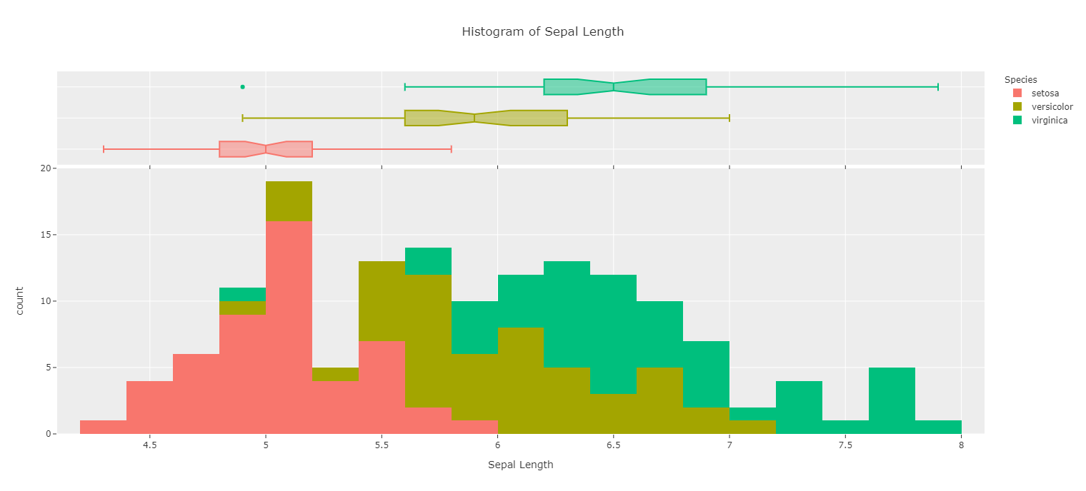
plot(iv.histogram(x = "sepal_length", color = "species"))
Show Marginal Distribution
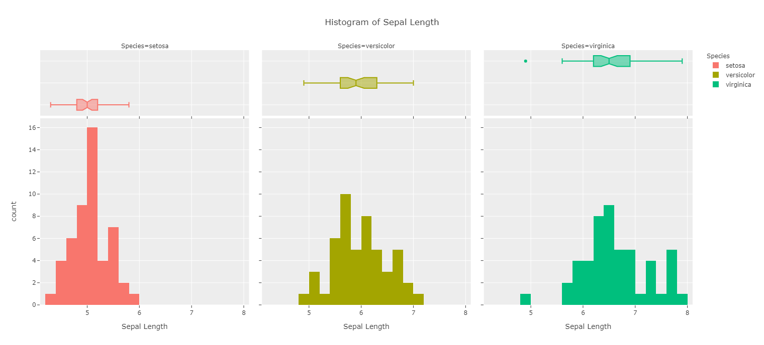
The marginal distributions can be shown above the histogram:
plot(iv.histogram(x = "sepal_length", color = "species", marginal="box"))
Facet Plots
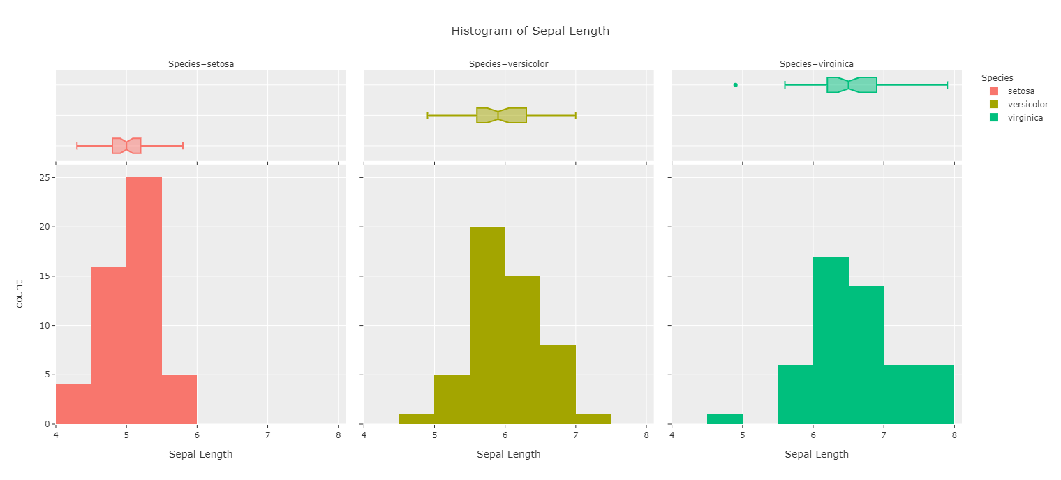
And the plots can be faceted either vertically or horizontally for readability:
plot(iv.histogram(x = "sepal_length", color = "species", facet_col = "species", marginal="box"))
Customize Bins
The number of bins is also customizable:
plot(iv.histogram(x = "sepal_length", color = "species", facet_col = "species",
marginal = "box", bins = 10))
Titles
Titles can be removed if disruptive:
plot(iv.histogram(x = "sepal_length", color = "species", facet_col = "species",
marginal = "box", bins = 10, has_title = False))

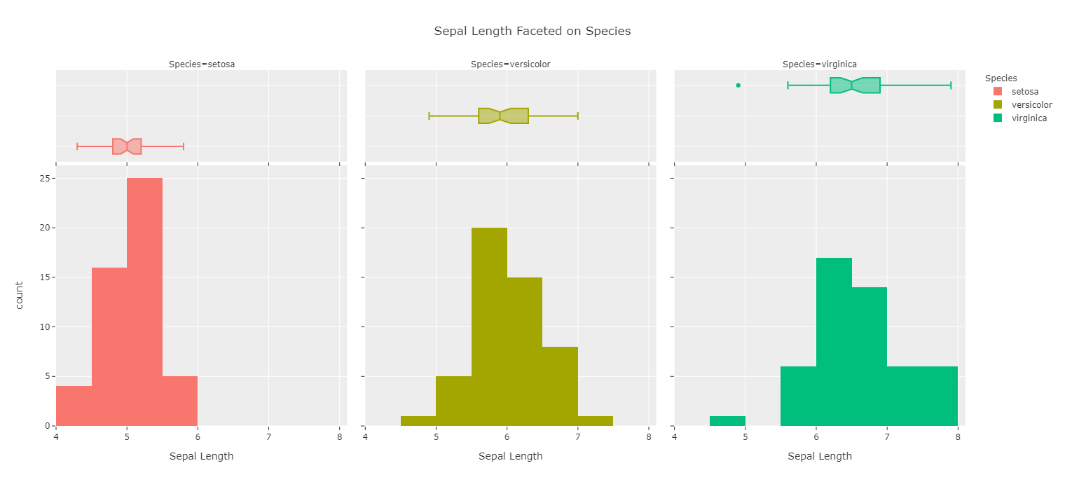
Or renamed to what the user prefers:
plot(iv.histogram(x = "sepal_length", color = "species", facet_col = "species",
marginal = "box", bins = 10, title = "Sepal Length Faceted on Species"))
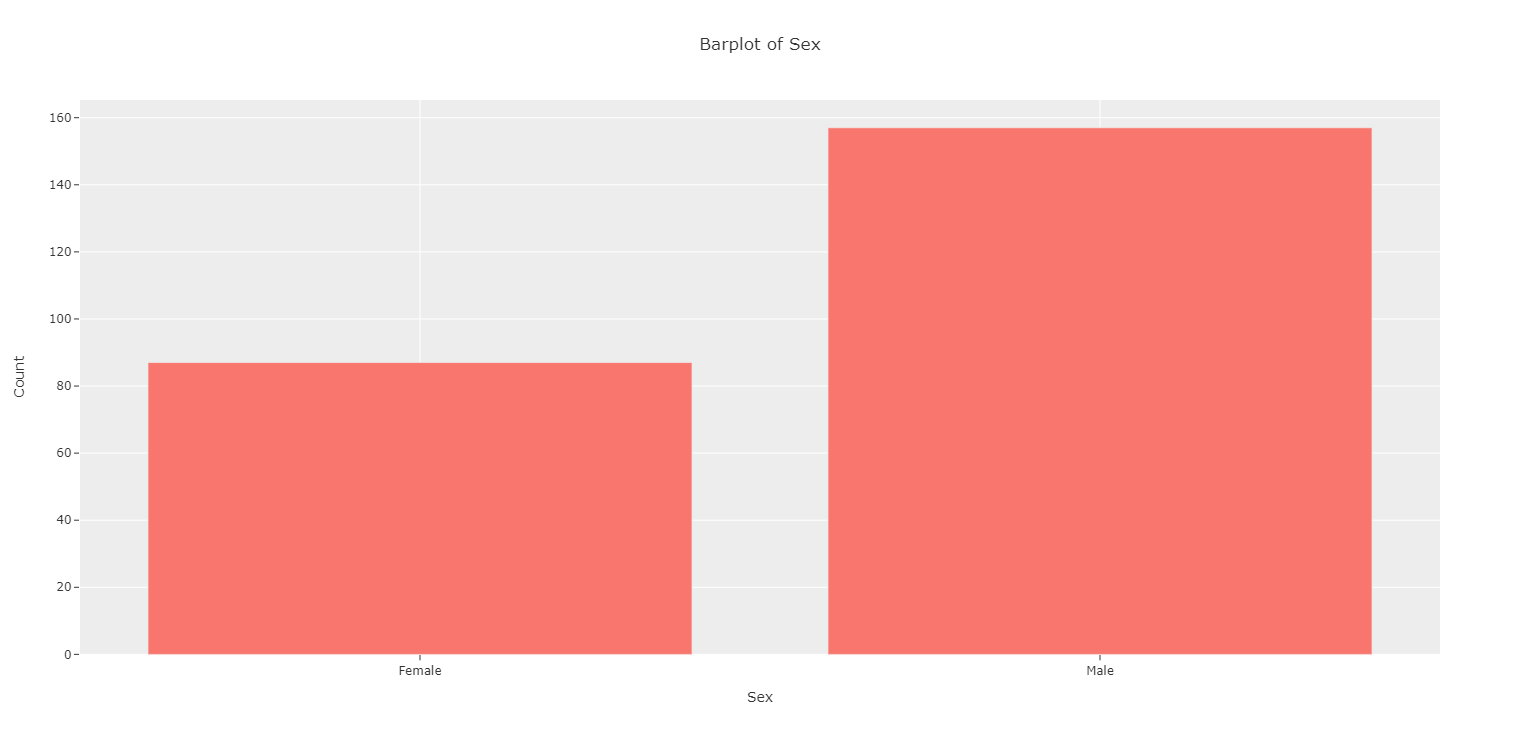
Bar Plot
For bar plots we will use a dataset where more categorical variables are included:
df = px.data.tips()
iv = Interactive_Visuals(df)
A basic bar plot can be created by using a categorical variable:
plot(iv.barplot(x = "sex"))
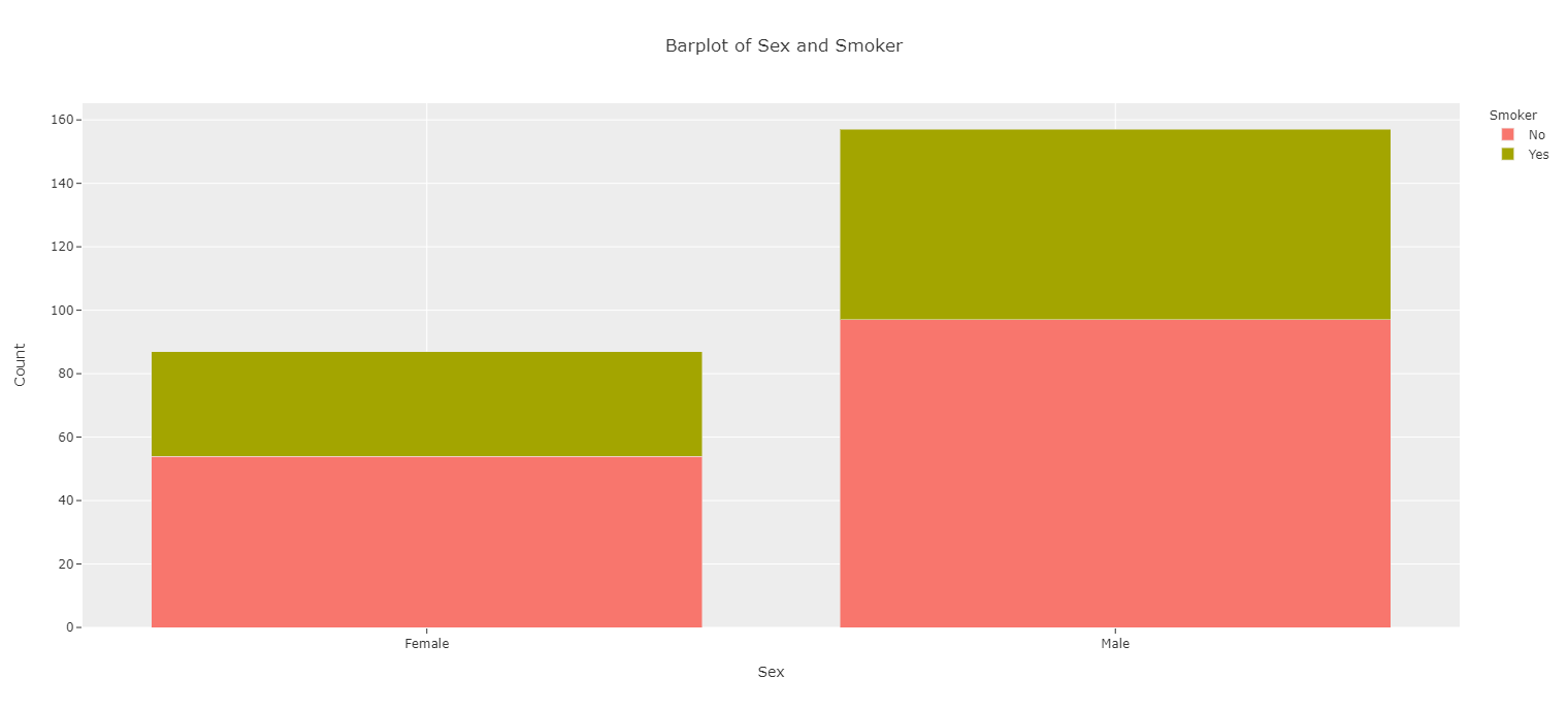
Stacked Bar Plots
Stacked bar plots can be created by setting a categorical variable to color:
plot(iv.barplot(x = "sex", color = "smoker"))
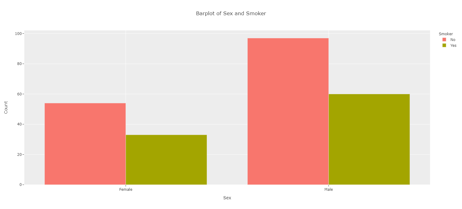
Grouped Bar Plots
These can also be set as grouped bar plots:
plot(iv.barplot(x = "sex", color = "smoker", barmode = "group"))
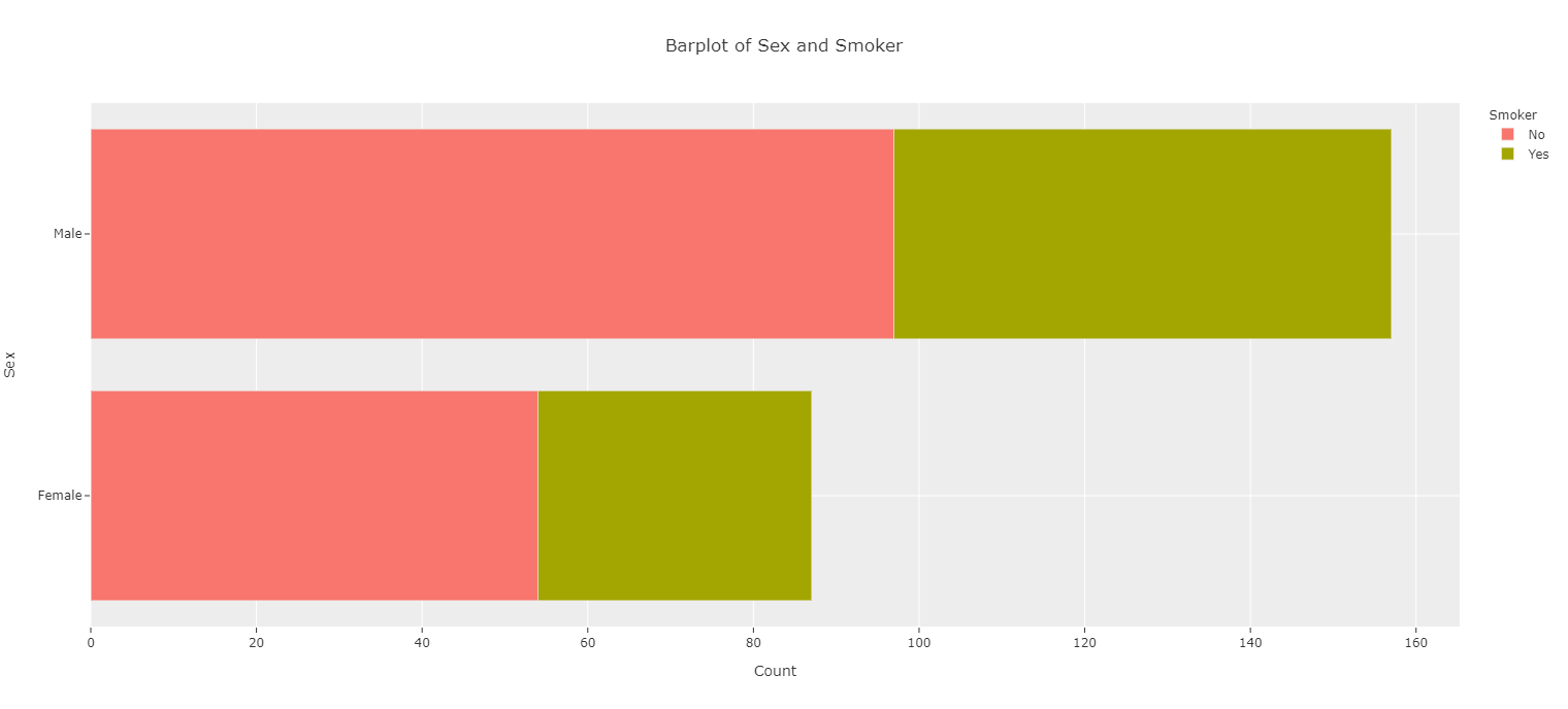
Horizontal Bars
Bars can also be set horizontally:
plot(iv.barplot(x = "sex", color = "smoker", is_horizontal = True))
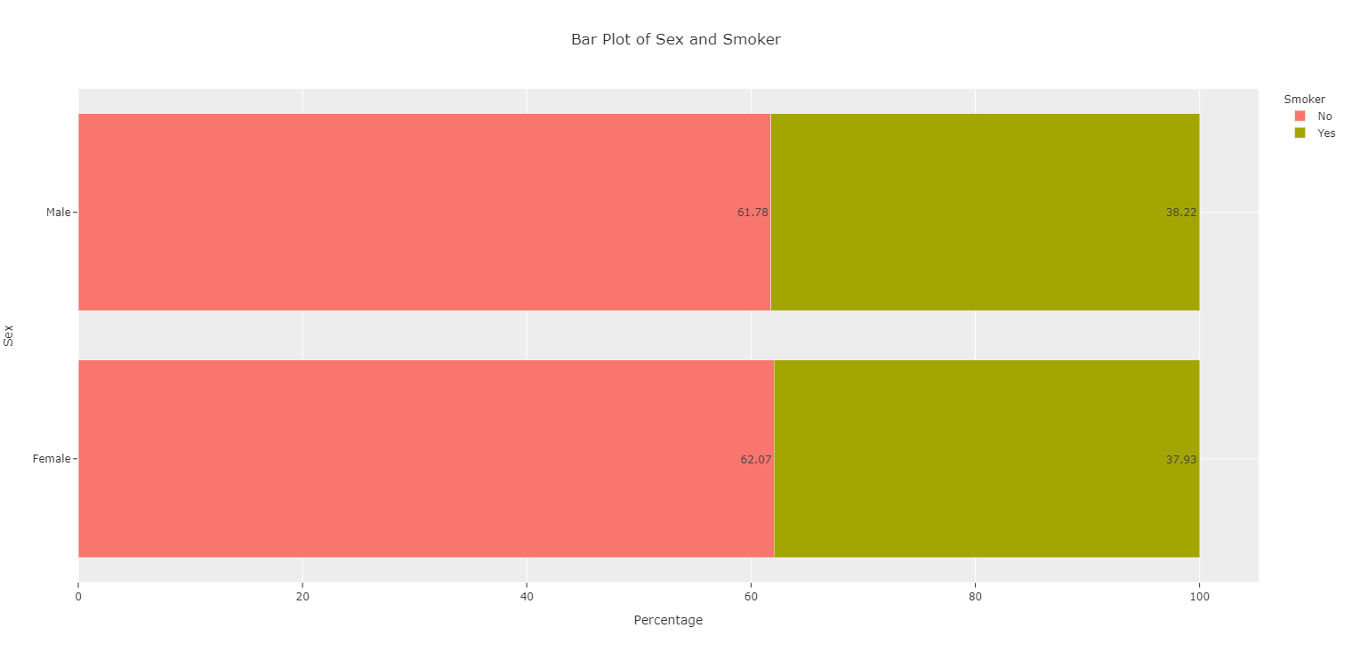
Plot on Percentages
And bar plots can be plotted based on Percentages and not Counts:
plot(iv.barplot(x = "sex", color = "smoker", is_horizontal = True, is_percent = True))

Add Actual Values Onto Plots
If graphs are going into PowerPoints, actual values can be added to graphs for both count and percentage cases (percents automatically round to two decimal places):
plot(iv.barplot(x = "sex", color = "smoker", is_horizontal = True,
is_percent = True, show_num = True))